After going to all of the alternative places I essentially saw three types of venues: museums, galleries, and the street.
The two actual museums which I went to were similar in some ways and different in others. Aside from what was in them the main difference was the lighting. It probably had to do with the content but the DIA had dim lighting in some areas where as the U of M museum was similar throughout. Personally neither of the ways hindered the work because mostly it was tailored to it and added to the experience of seeing the work.
There were two main categories of galleries clean white spaces like the Gallery, Lemberg, and David Klein. But there were also warehouse type like MOCAD. Personally I enjoyed the clean white space better. I felt that it really removed all distractions for a piece and I felt more focused on them and enjoyed them more in that setting. Whereas MOCAD sort of creeped me out. I just never felt comfortable and just had the sense of wanting to get out of there rather than stay and appreciate the art.
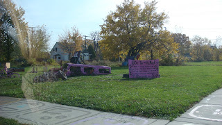
I only went to one street venue, Heidelberg, but I felt that it suited the work nicely not only because of the setting but the location of the work as well. So I think it allowed me to enjoy the project a lot more because it gave it a setting, mainly being outside, that suited what was going on, rather then seeing it and a gallery going “Dirty old stuffed animals on a pole? What!?” So that was good.
So there were definite differences in the venues besides the work they housed which changed how I interacted with it--mainly Heidelberg, Legitimize it--again Heidelberg, provide context--the museums, and alter the associations I brought--the galleries, whether it be nothing or something.
Friday, November 5, 2010
Research 3 - Michael Pavlik
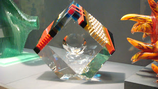
A piece of Michael Pavlik’s work was on display in the DIA, and I absolutely loved that. It was a glass piece, which is the first artwork picture below, and I wanted to see what else he had done. And surprise I loved it. It all is in a art deco style I love, glass which I love, and has a lot of different colors, explained below, which I also loved.He is a Czechoslovakian (Czech Republic) contemporary glass artist, which is what I assumed from the piece which I saw. Chard deNiord wrote “Pavlik’s…combinations of artificial corners and natural curves,…prehensile arrows and semi-circles, interact in such a way that the infinite prismatic mirroring that occurs inside the glass imbues these sculptures with a metaphysical elegance”
I completely agree with this statement because when I saw one of his pieces in person I noticed the prismatic effect. Every angle I looked around put a new color in the center as well as a new tint around the edge. You’ll notice my picture shows it blue and yellow, that is not the only color you see, because I remember seeing orange.
Artwork:
http://www.liveauctioneers.com/item/4511092http://www.tampamuseum.org/collections/sculpture?page=1http://www.artnet.com/artist/27137/michael-pavlik.htmlhttp://www.cmog.org/dynamic.aspx?id=10214
Research 2 - Alyssa Monks
Alyssa Monks was the artist who was being featured at the David Klein gallery when I went and I love the realism in her work, as well as the abstraction in water. She has a really nice website which I took most of the information from and has a lot of her work where you can see that she has a particular interest with people immersed in water.
She was born in 1977 in Ridgewood New Jersey. She started oil painting as a child and went further on to study at the New School in New York and Montclair State University. Earned her BA from Boston College in 1999. She then went on to study painting in Florence. Afterwards she earned a MFA from the New York Academy of Art.
She has lectured at universities nationwide, and has also taught flesh painting t the New York academy of art where she had studied. In her work she tends to explore the tension between abstraction and realism, distorting the body. Which I definitely noticed in her work where the people looked so very real and the water in the ones I saw abstracted the people as well as being painted in a more abstracted way. Which is essentially what she strives for as she strives to pain people in the most real way that she can. Doing that she discovered that realism and abstraction were symbiotic to her which leads to what she does today.
Art Work:
Resources:
http://alyssamonks.com/
Research 1-Mark Sengbusch
Mark Sengbusch is the artist who was being featured at the Lemberg Gallery when I went there and I loved the design, colors and the care which was in each piece of his. But mostly it was in the contemporary art decoey style which I adore. Not a lot can be found on him but I highlighted the main things I found.
Sengbusch received his education at Cranbrook Academy of Art (MFA) and College for creative studies(BFA). Now, he is currently the owner and sole-proprietor at Mark Sengbusch Studios. He has been a Exhibition assistant and assistant preparator at Cranbrook Art Museum, and was as an Exhibition Assistant at Center Galleries at College for Creative Studies.
The artist statement off his website reads:
“Line returns from the edge as incision.
I welcomed him to my newfound rectangular island home.
Formalist setinals stalk my intuitive energy kin.
I trace six style backwards and press them in a space-time, man-machine, sandwich.
Utilitarian patterning jumps off armor, rugs, plates to join me in embracing their now primary function”
Art work:
Resources:
http://oneartworld.com/artists/M/Mark+Sengbusch.htmlhttp://www.linkedin.com/pub/mark-sengbusch/3/970/822http://www.101up.com/
Trip to Detroit
What can I say about Detroit other than, well, it's Detroit! Anyway here is where we went
1. Heidelberg-Neat, innovative, creepy, and not all that much to my taste. But they did recycle lots of old items and some of the items were pretty interesting. I feel bad for the stuffed animals if and when it rains though, and in the cold and snow…poor teddy… Pictures below.
Like the Rochester trip we couldn't walk to the other venues.
1. C-Pop-researched on line not much there, barely found location/hours why? It no longer exists, so don't try to go there. Found their ex-mailbox and the ex building though. No pictures obviously
2. MOCAD-Creepy building, creepy art show. I understand that the main show was from kids from broken homes, but it was really creepy. One was a child's drawing of “Daddy killing mommy” and another was a depressed teenage girl. It was really sad and creepy and I have had enough of that in my life. Yeah, so I hated it. But there was artist we saw being featured at the U of M art museum when we went in there too. No pictures were allowed here.
DIA-It’s the DIA, that about sums it up. A lot of interesting stuff, but it may have been the sugar low/vertigo I had going on (not eating for a long period of time is a bad idea, especially when you go on an elevator and the rest of the time you start or stop moving the ground "moves" beneath you) but I was hoping for a lot more stuff that I would just adore, but the glass work they had was amazing and they had four swords which I really liked, as well as a few other pieces here and there. Also some of the buildings architecture around the actual exhibits were in a style which I adore. And again I have to completely knock some contemporary art. Look I get you need to respect an artist’s vision, but paint a canvas red and put a vertical white line down it—and the like— is not worthy of being preserved in a museum, I’m sorry but I have to draw the line there…no pun intended. Pictures below.
Heidelberg-This is the end portion of the Heidelberg block
Heidelberg-Nothing was left untouched, not even the sidewalks.
Heidelberg-Yard art anyone?
Heidelberg-No need to decorate for a party anymore.
Heidelberg-Poor stuff-es
Heidelberg-Me, by a large post of all of those poor animals.
Heidelberg-A new way of decorating you homes exterior
Heidelberg-Another portion.
Heidelberg-Another pole.
Heidelberg-A close up of a front deck.
Heidelberg-There was some mosaic art going on.
Heidelberg-The front of the project.
MOCAD-No cameras were allowed to function inside, but outside worked for me.
DIA-a wood collage
DIA-This looks interesting and I see more and more the more I look at it.
DIA-Some Native American masks.
DIA-Another native American mask my mom liked
DIA-Mummy!!!
DIA-Another Egyptian casket, one of many for this particular person I have been told.
DIA-Hieroglyphics
DIA-Me by I think this was a piece from the African section.
DIA-More African art
DIA-A close up of one. It's a monkey!!!
DIA-This looks prettier from far away
DIA-The only swords in there, this was my favorite!
DIA-A picture of all of them.
DIA-Now that's a book cover!
DIA-Coins, woohoo I'm rich, wait they aren't mine : (
DIA-Proof my mother hijacked my camera (I took out most of her hijackings, missed one)
DIA-GLASS WORK <3, this was my second favorite piece in the museum.
DIA-The second best glass piece.
DIA-Me by a Disney castle. I love Disney!
DIA-Not as pretty as the U of M one, but still great!
DIA-My favorite piece in the museum, the French Pointer. Personally I think it looks sort of like a lab, which is why I love it ; )
DIA-I lied there was another sword, in this sculpture
DIA-The winding staircase.
DIA-I really like this staircase.
DIA-Pretty architecture!
DIA-It's my indoor courtyard!!!! Ironically if I remember correctly it is the Kresge courtyard.
This is the page from my sketch book for the Heidelberg project. One of those poor stuff-es
Another page, of the indoor courtyard I love
This concludes the Detroit trip, thus the actual trip.
Subscribe to:
Comments (Atom)


